
Identity / Print / Digital
Client: RDI
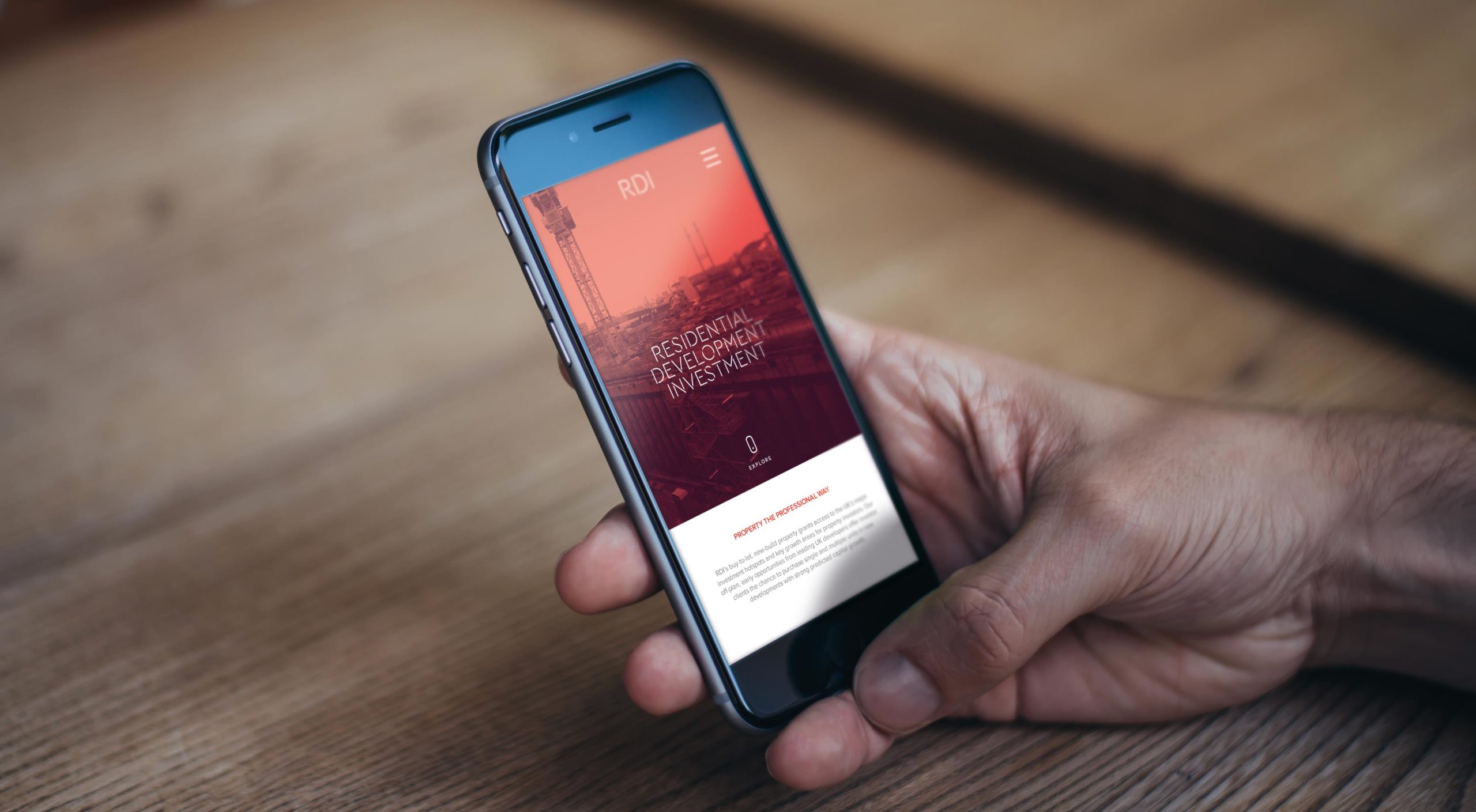
Seeing Red:
A new residential investment start up by three experienced property guys, RDI wanted a distinctive brand that bridged the gap between the traditional and the modern. Feeling a bit ‘greyed out’ by previous forays into branding, they really liked our more vibrant options and the typography – particularly the modular stencilled logo which seemed to fit perfectly with their chosen industry.
Launch site: rdiuk.co.uk


Similar Projects
Kinnarps - Nu CampaignSomthing Nu

By Alastair LittleA Little something special
Appin DevelopmentPride of Scotland
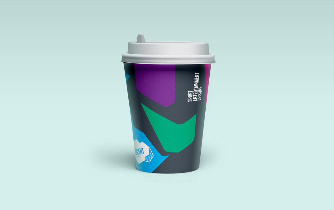
Vibrant PartnershipsNot a venue. A destination.

AshbyCapitalBuilding Creativity

Workplace HouseEverything in its place

BPS Worldwide RecruitmentAttracting attention
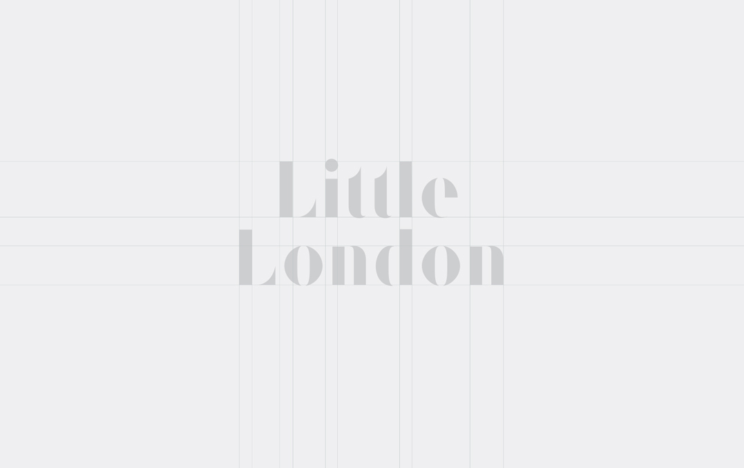
Little London EstateWelcome to work
MCC - Spirit of CricketCore of the game

Third Sector PropertyA clear direction

RDISeeing Red
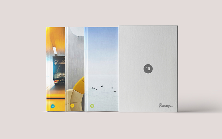
Kinnarps - 10 SeriesTen of the best

The Connolly WorksA new Chapter

Parent MarketingBorn with a vision

Atum Cove - EgyptCharting The Red Sea

Rock UK Adventure CentresIgniting a passion

Novae GroupSculpted excellence
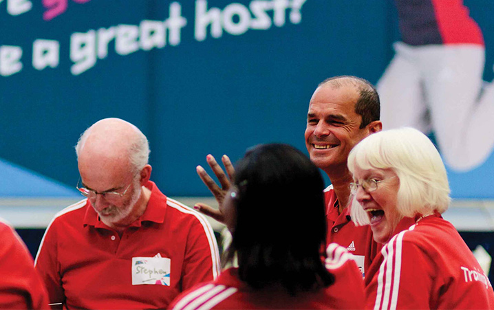
London 2012Playing our part
All copyright Sadler Greenwood 2025